
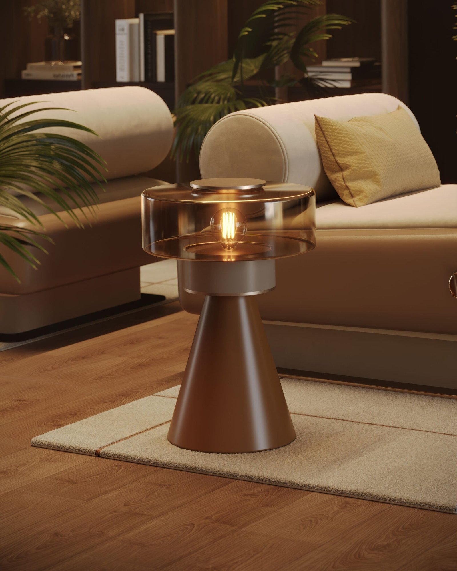
27 Side Table Tricks That Prove Less Really Is More in Your Living Room
Disclosure : This post may contain affiliate links or paid partnerships. I may earn compensation if you click a link or make a purchase, at no additional cost to you. See my disclosure for more info.
The most beautiful side tables in the world share one quality above all others.
Restraint.
They show you only what matters. They resist the temptation to fill every inch. They trust that negative space is not absence — it’s a design element with as much value as any object placed on the surface.
Most people do the opposite. They accumulate. They add. They layer until the surface can’t breathe.
This list is an argument for subtraction. For the edit. For the kind of deliberate minimalism that makes a room feel calm, considered, and genuinely beautiful rather than merely full.
These 27 tricks are about making fewer, better choices — and trusting that less will always do more.
Let’s begin by taking things away.
Remove Before You Add
1. Remove everything. Evaluate before you return a single object.
Minimalist styling begins with removal, not addition.
Every object currently on your side table is there by default, not by decision. Strip the surface bare. Hold each object separately and ask: does this earn its place? Does it add something nothing else provides? If not, it stays off. You build from zero, upward, with intention at each step.
2. Choose three objects. Commit to that number.
Three is not a starting point. Three is the number.
One object at each height — tall, medium, low — forms a complete visual composition. The human eye resolves it immediately. Anything beyond three requires justification. Most of the time, that justification doesn’t exist. The discipline of three is the discipline of editing.
3. Create one clear vertical gradient and leave it at that.
Height variation is the only complexity a minimalist side table needs.
Tall. Medium. Low. That gradient gives the eye a path to follow. A book stack with one object resting on top achieves this without introducing any additional visual noise. Three levels. One composition. No more required.
4. Identify one object that leads. Everything else follows.
A clear hierarchy eliminates visual competition.
Choose your primary element — a sculptural vase, a bold lamp, a striking clock — and let it lead. Two objects vying for attention is conflict. One object leading with two supporting is composition. The restraint of this decision creates more visual calm than any amount of careful arrangement can produce.
One Good Light Source Is Enough
5. Use one warm table lamp. That is sufficient light for the arrangement.
Overhead lighting is diffuse and directionless. A table lamp is focused and warm.
One well-placed lamp on a side table provides the layer of ambient light that transforms a room from functional to atmospheric. No track lighting. No supplementary spots. One lamp, positioned with intention, does everything a minimalist living room needs from its side table lighting.
6. Go cordless to eliminate the one element that always disrupts.
A cord is not a small thing. It is a line that the eye follows involuntarily out of the composition.
A cordless LED lamp removes that line. The surface is clean. The arrangement reads without interruption. This is not a luxury purchase — it’s a removal of a design obstacle. Every minimalist purchase should eliminate rather than add.
7. Add one candle as a secondary element. Just one.
A candle alongside a lamp adds organic warmth that electricity alone cannot provide.
It is also a second light source at a different height, which adds genuine dimensional depth to the arrangement. This is one of those rare additions that actually simplifies how the composition reads — the warm, flickering light unifies the table rather than complicating it.
The Case for Less on Every Level
8. Two or three books. One object on top. Done.
The book stack is the minimalist’s height-building tool of choice.
Two or three volumes create a plinth. One small object rests on top. The combination produces vertical variation, decorative texture, and a display of personal taste — all from objects already present in the home. No new purchase required. No additional complexity introduced.
9. One color story. Spines that support it or face them inward.
Color coherence is the minimalist version of color coordination.
Every book spine that appears in an arrangement should either support the room’s tonal palette or disappear from it. Facing books spine-inward achieves the latter perfectly — a uniform neutral that harmonizes with any room and introduces no visual conflict. One decision. Permanent coherence.
10. One small tray. Everything inside it.
A tray is a boundary. And minimalism is fundamentally about boundaries.
Within the tray, objects are contained. Outside it, they spread. The tray defines exactly where the arrangement begins and ends, preventing the gradual sprawl that turns a composed surface into a cluttered one. One tray. Everything within it. The surface outside it: empty.
One Living Thing. That’s All You Need.
11. One plant. One vessel. One living element.
A single small potted plant in a simple container, or one stem in a bud vase.
One living thing on a surface is quietly transformative. It introduces organic form and natural color that no manufactured object replicates. Two plants becomes a collection. One plant is a composition element. The restraint preserves the impact.
12. If you prefer dried: one stem, one vessel, nothing more.
The minimalist approach to dried botanicals is identical to its approach to everything else: less.
A single stem of pampas grass in a narrow vase. One bunch of eucalyptus in a simple vessel. The singular botanical reads as intentional and considered. Multiple dried arrangements read as collection — a fundamentally different and busier proposition.
13. One natural object. Chosen for form. Placed with confidence.
Driftwood. A branch. A smooth river stone.
A single found natural object placed deliberately communicates more than an elaborate arrangement of expensive objects. Its roughness, its imperfection, its lack of obvious purpose — these qualities create the visual interest that restrained compositions need. One piece. No explanation required.
Two Materials. Maximum.
14. Two materials in deliberate contrast. Not more.
Material variety has diminishing returns past two.
A ceramic vase against a brass candle holder. Glass beside a woven basket. The tension between two contrasting materials — smooth and textured, hard and woven — produces all the visual richness a composition needs. A third material dilutes this tension. A fourth eliminates it entirely.
15. One soft element against the hard surface. The contrast does the work.
Hard surfaces read cold. One soft element changes this.
A woven coaster under a single object. A small folded linen cloth. The edge of a macramé plant hanger. One textile element is sufficient to shift the arrangement’s emotional temperature from cool to warm. More than one textile starts to compete with the objects it’s meant to support.
16. One metallic element. The reflective quality multiplies.
A single metallic surface captures ambient light and redistributes it across the arrangement.
A brass picture frame. One brass accent. One copper piece. The effect — a subtle gleam that lifts the whole composition — comes entirely from the singular quality of that one reflective surface. Add a second and the effect halves. The restraint is the elegance.
One Object That’s Truly Yours
17. One personal object. One story. Everything else supports it.
A well-edited side table has one object that speaks about the person who placed it.
A stone from somewhere that mattered. Something inherited. A piece made by someone. That single authentic element carries more communicative weight than any number of perfectly curated decorative objects. It is what makes the arrangement irreplaceable — because it cannot be bought in a store or replicated anywhere else.
18. One leaned frame. Informal, flexible, commitment-free.
A 4×6 or 5×7 framed print resting against the wall is a minimalist choice precisely because it refuses permanence.
It can be changed in five seconds. It costs no tools to install. It adds depth and personality without adding complexity. The informality of the lean — its deliberate casual quality — suggests an ease with the space that mounted art can rarely convey.
19. One small dish. The everyday becomes intentional.
Reality: objects land on side tables. Design for this with one beautiful small dish.
Marble. Ceramic. Whatever material suits the arrangement. One vessel for the inevitable daily items — keys, rings, glasses — transforms what would be clutter into a composed element. The everyday is integrated, not apologized for. That is minimalism in its most practical form.
The Space You Leave Is Part of the Design
20. One-third of the surface: empty. Always.
This is non-negotiable in minimalist composition.
Negative space is not wasted space. It is the space that allows every object to be seen. Reserve at minimum one-third of the table surface as completely open. The objects within the remaining two-thirds gain presence, weight, and visual authority from that open expanse. It is the silence that makes the music audible.
21. Match object scale to the surface. No exceptions.
Scale misjudgment is visual noise regardless of how restrained everything else is.
An oversized object on a small table overwhelms the composition. An undersized grouping on a large table looks abandoned. Both conditions create the same unease: something is wrong, even if the viewer cannot name it. Proportion is the discipline that makes restraint legible.
22. Nothing taller than 1.5 times the lamp shade. Honor the ceiling.
Minimalism requires proportion as much as subtraction.
The 1.5x lamp shade guideline establishes the vertical ceiling of the composition. Objects that exceed it create visual instability — the arrangement seems to be reaching beyond itself. Work within the ceiling and everything holds. Exceed it and something fundamental is lost.
Final Refinements That Cost Nothing
23. One scent. Consistent. Invisible but felt.
Minimalism extends to the olfactory dimension.
One scented candle or one reed diffuser with a single consistent scent associated with your space. Not a rotation of different scents — one. Over time, this scent becomes the invisible signature of the room, triggering comfort and familiarity in anyone who enters regularly. Scent simplicity compounds over time.
24. One seasonal exchange. One object. Once per quarter.
The minimalist maintenance practice for a side table.
One object changes per season — a stem, a small candle, a natural element. One change is sufficient to refresh the entire arrangement’s sense of currency. More changes introduce the complexity of re-composition. One is the minimalist number here too.
25. Elevate one object by one inch. Signal hierarchy through restraint.
A marble coaster beneath a single object.
That one inch of elevation communicates: this is the most important piece in the arrangement. It does this without any additional visual noise. The pedestal is small. The effect is outsized. Minimalist interventions should always have this quality — small action, significant result.
26. Monthly edit: remove before you consider adding.
The minimalist monthly practice is primarily subtractive.
Ask: what can come off? What has stopped earning its place? What has become so familiar it has become invisible? Remove these things first. Only then consider whether anything new belongs. The best minimalist side tables are defined by what is absent as much as by what remains.
27. Assess from across the room. The distance tells the truth.
Stand at the far wall. Look honestly.
Does the arrangement hold its composure at distance? Does it contribute to the room or impose on it? Does it look confident or busy? If something feels wrong from across the room, the answer is almost always: remove one thing. Minimalism, in the end, is the practice of knowing when you are done.
The Discipline of Done
The hardest part of minimalist styling is stopping.
The temptation to add one more object, make one more adjustment, fill one more inch of empty surface — this is the impulse that defeats restraint at the last moment.
Choose three techniques from this list. Apply them with the explicit goal of removing as much as you add. Use what you already have. Put nothing back that does not earn its position.
The room you’re building is not a full one. It is a considered one. And the difference between full and considered is the difference between a surface that makes you feel cluttered and one that makes you feel calm.
Your side table is ready to be edited. Start subtracting.
And when someone sits in your living room and exhales quietly, without quite knowing why, without reaching for their phone — that’s the 27 subtractions at work.