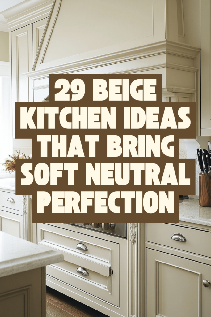
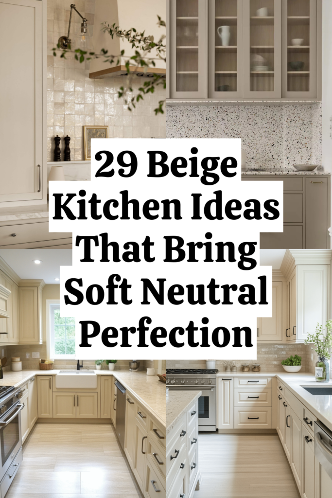
Beige Kitchen Mastery — 29 Tricks for a Space That Radiates Warmth and Sophistication
Disclosure : This post may contain affiliate links or paid partnerships. I may earn compensation if you click a link or make a purchase, at no additional cost to you. See my disclosure for more info.
Close your eyes for a second.
Imagine running your hand across a kitchen countertop. It’s cool. Smooth. The color of wet sand after a wave recedes. Light catches the faintest veins of gold running through the stone.
Behind the counter, creamy cabinets rise to the ceiling. A pendant made of woven rattan hangs low, casting lace-like shadows across the island. Everything glows — soft, quiet, intentional.
Now open your eyes.
You’re back in your kitchen. The one with the vinyl countertops, the dated hardware, and the overhead light that makes everything look like a hospital corridor.
The dream and the reality are miles apart. And every time you close that gap in your imagination, it stings a little more when reality floods back in.
So here’s what I want to tell you.
That dream beige kitchen? It’s not out of reach. It’s not reserved for people with renovation budgets the size of car loans. It’s built on specific design decisions — 29 of them — that anyone can learn and apply.
And we’re starting right now, with the surface your hands will touch most.
The Surface That Sets the Stage: Getting Your Countertops Right
Countertops live at the center of every kitchen interaction. They’re where morning coffee happens, where meals take shape, where elbows lean during late-night conversations. Get these right and the whole room lifts.
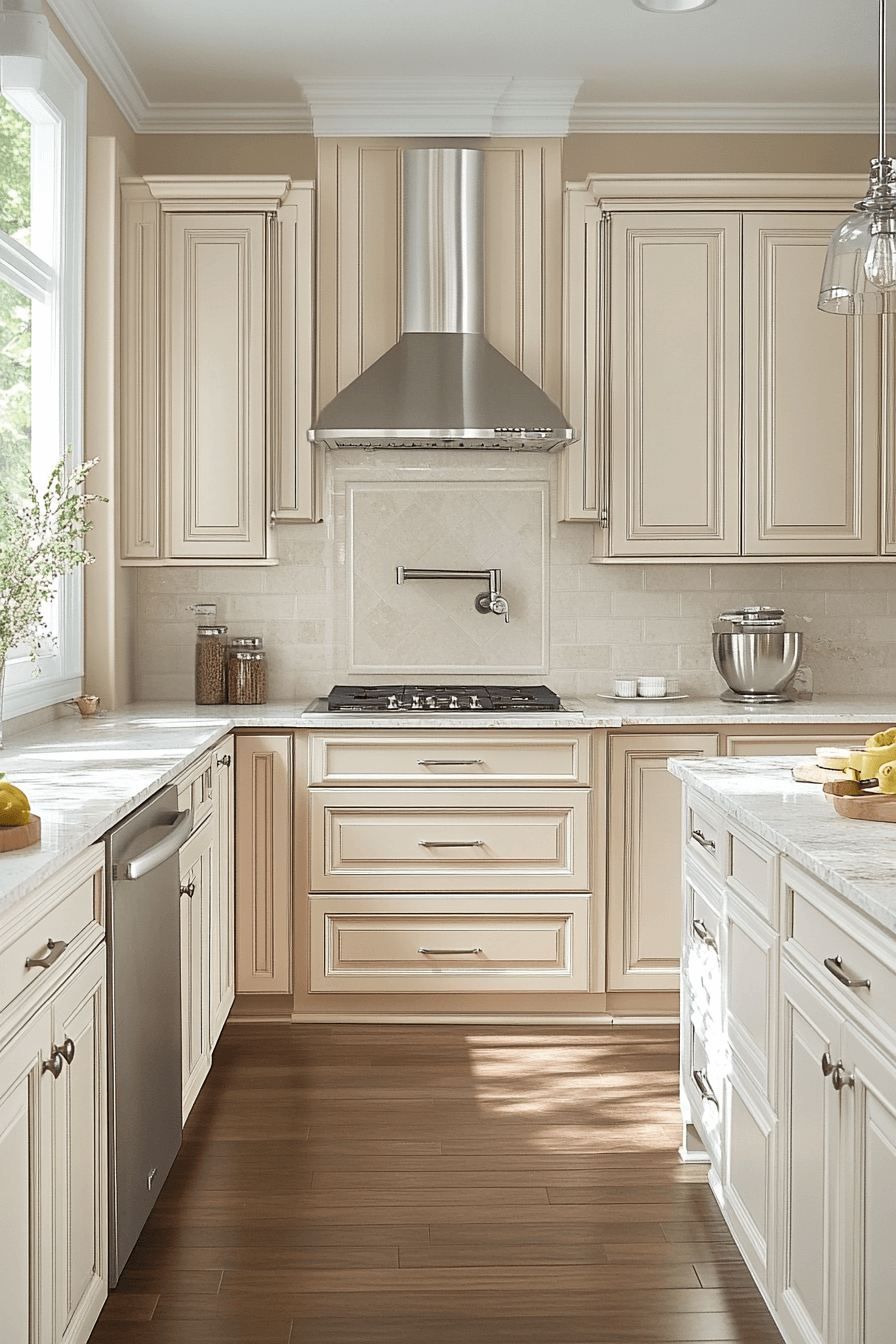
1. Choose stone with soft, understated veining.
Heavy, dramatic marble patterns fight for attention in a beige kitchen. They dominate rather than integrate.
Look for quartz or natural stone with gentle, wispy movement in cream, taupe, or warm gray. Let the surface enhance your palette instead of overpowering it.
2. Beef up your countertop edge to at least two inches.
Thin edges look thin. That’s it. No amount of premium material saves a skinny edge profile.
Go two inches or thicker. Mitered. Squared. Waterfall. A chunky edge adds weight, substance, and the unmistakable feeling that money was well spent.
3. Create a waterfall edge on your island.
When the countertop material cascades seamlessly down the sides to the floor, the island becomes a single sculptural object.
In beige or sand tones, it looks carved. Geological. Serene and powerful at the same time.
4. Match your backsplash to the countertop — not the cabinets.
This surprises people. But connecting backsplash to countertop creates an unbroken visual ribbon that makes the kitchen feel bigger, calmer, and more cohesive.
Try it. The difference is immediately obvious.
Tiny Metals, Enormous Effect: Fixtures and Hardware Done Right
With surfaces established, shift to the small details that punch way above their weight class.
5. Go with unlacquered brass or champagne gold hardware.
Chrome fights the warmth. Matte black can feel too aggressive against soft beige.
Unlacquered brass develops a living patina — it literally improves with age. Champagne gold offers a cleaner, steadier warmth. Both are ideal beige companions.
6. Keep your faucet and hardware in the same metal finish.
Unless you’re deeply confident about mixing metals, don’t gamble. Same finish on everything visible. Pulls, knobs, faucet.
Consistency generates visual peace. And visual peace is what expensive kitchens feel like.
7. Replace every outlet cover with a wall-matching version.
Those white plastic rectangles on your beige walls? They’re visual hiccups — tiny, constant, unnecessary.
Pop them off. Replace with matching covers. Takes minutes. The walls finally breathe.
The Invisible Game-Changer: How Lighting Transforms Every Shade of Beige
Here’s where many people stop short. They build a beautiful beige kitchen and then light it with whatever bulbs came in the box.
That’s like tailoring a perfect suit and wearing it with flip-flops.
8. Switch every bulb to warm-toned — 2700K to 3000K.
Cool bulbs murder beige. They drain the warmth and leave you with something that reads flat, gray, and vaguely depressing.
Warm bulbs make beige glow like it’s lit from within. Check every fixture. Swap every cold-toned offender. The mood shift is instant.
9. Layer in LED strips beneath upper cabinets.
This soft downward light bathes your countertops and backsplash in warm ambiance. It eliminates harsh shadows and lets surface textures shine.
At night, dim the overheads and let the under-cabinet glow carry the room. It becomes the coziest spot in the house.
10. Install a dimmer switch on your kitchen’s main light.
Beige is a chameleon. Its appearance shifts with light intensity. A dimmer puts that transformation in your hands — bright and energizing for cooking, low and moody for entertaining.
In a beige kitchen, this isn’t optional. It’s critical.
The Visual Architecture: Cabinet Moves That Define the Space
Cabinets dominate the sightlines. They’re the framework within which every other decision lives. Handle them with the seriousness they deserve.
11. Commit to shaker-style cabinet doors.
They’re the Goldilocks of kitchen cabinetry. Not too modern, not too traditional, not too anything.
Clean lines with just enough detail to feel crafted. A style that’s been relevant for generations and shows zero signs of fading.
12. Carry uppers all the way to the ceiling.
The space between your cabinets and ceiling? It’s not storage. It’s not decoration. It’s visual dead weight.
Ceiling-height cabinets add stature, polish, and a finished quality that standard-height cabinets simply can’t deliver.
13. Split tones — lighter on top, deeper on bottom.
Pale cream uppers keep the room feeling open. A richer sand or wheat tone on lowers anchors the composition and camouflages daily wear.
The rule: both tones must share the same undertone. Break this rule and you get subtle visual discord that you can feel but can’t identify. Maddening.
14. Add fluted panels to your island face.
Flat islands are forgettable. Vertical fluting gives you texture, dimension, and shadow play that make the island read as a custom piece rather than a box with a countertop.
Small upgrade. Dramatic result.
15. Remove hardware from upper cabinets.
Handleless uppers create a smooth, unbroken visual line that draws the eye up. The kitchen feels more spacious.
Hardware on lowers adds grip and interest exactly at hand height. Intentional minimalism that works harder than it looks.
The Starting Line: Nailing Your Beige Foundation
Everything above depends on getting this base layer right. Skip it or rush it, and the entire project leans on a wobbly leg.
16. Find your undertone before you find your shade.
Beige carries hidden undertones — pink, yellow, green, gray. These undertones define the emotional temperature of the finished kitchen.
White paper test. Hold the swatch against it. The underlying hue appears. Choose the undertone. Then and only then choose the shade.
17. Calibrate your beige to your kitchen’s natural light.
North-facing kitchens bathe in cool, blue-tinged light. They need a warm beige — gold, honey, wheat — to feel alive.
South-facing kitchens get generous warm sunlight. A cooler, grayer beige works perfectly because the sun provides the warmth automatically.
Understand the light. Then choose the beige.
18. Test your paint through a full 48-hour light cycle.
Slap it on the wall. Big swatch. Watch at 7 AM. Watch at noon. Watch at 9 PM under your kitchen lights.
Same surface. Three different experiences. Never lock in after a single glance. The cost of patience here is zero. The cost of impatience is enormous.
19. Apply matte to your walls, satin to your cabinets.
Walls get matte for that soft, rich depth. Cabinets get satin for sheen, durability, and easy cleanup.
The reverse creates problems. Matte cabinets attract fingerprints like magnets. Satin walls look odd. Stay with the formula.
What Makes It Feel Like Home: The Finishing Touches That Add Soul
The bones are in place. The details are dialed. Now add the elements that make someone walk in and exhale.
20. Fill your open shelves with handmade pottery in earthy tones.
Mass-produced sets lack character. Handmade ceramics — with their slight imperfections and tonal variations — bring soul.
Vary the heights. Mix the shapes. Let it look collected over time, not purchased in one trip.
21. Bring living green into the space.
One potted plant. A few herbs. A branch of olive or eucalyptus in a stoneware vase.
Green and beige is one of nature’s most harmonious combinations. It adds vitality without introducing visual competition.
22. Choose a composite sink in a warm, countertop-matching tone.
White porcelain breaks the visual flow. Stainless steel fights the warmth.
A composite sink in biscuit, sand, or warm stone disappears into the countertop. The surface reads as one uninterrupted canvas.
23. Group displayed items in odd numbers — always.
Three jars. Five books. One board.
Odd groupings are more aesthetically satisfying. Designers use this instinctively. Now it’s in your toolkit too.
24. Study the kitchens you’ve saved and find the common thread.
Open your boards. Look hard at the spaces that stopped your thumb.
They share patterns — undertones, textures, a sense of curated simplicity. When you decode that formula, you stop pinning randomly and start designing deliberately.
The Hidden Hero: Texture Tricks That Make Beige Unforgettable
Last layer. And arguably the most important.
Without texture, a beige kitchen is a smooth, uniform void. With texture, it becomes a space you can feel with your eyes before your hands ever touch a surface.
25. Tile your backsplash with handmade zellige.
Each tile is unique — slightly different in tone, in finish, in how it catches the light.
In cream or sandy hues, zellige creates a backsplash that shimmers with life. It rewards close inspection and long gazes equally.
26. Dress your range hood in textured plaster.
Limewash. Venetian plaster. Roman clay.
Applied by hand to your hood, these finishes respond to light all day long — revealing different textures and tones as the sun shifts. An appliance becomes an artifact.
27. Float open shelves in warm-toned natural wood.
Honey oak. White oak. Light walnut.
Wood grain gives a beige kitchen the organic contrast it needs to avoid visual monotony. Two shelves. Your favorite pieces. Natural beauty without effort.
28. Soften the floor with a natural fiber runner.
Jute, sisal, or woven wool along the work zone.
It cushions your feet, warms hard surfaces, and sends a subtle message: this kitchen was designed for people, not just Pinterest.
29. Hang a woven pendant above the island.
Rattan, cane, or wicker.
One organic pendant introduces shadow, movement, and rhythm. It’s the texture capstone that pulls the entire room together.
This Is Your Starting Line
You’ve been pinning long enough.
The distance between your dream beige kitchen and your reality isn’t measured in money. It’s measured in decisions — 29 specific, concrete, actionable ones.
Undertone. Texture. Light. Proportion. Restraint.
Beige is the warmest, most forgiving foundation you can build a kitchen on. But it demands intention. It rewards the people who pay attention to the quiet details that everyone else ignores.
So take this list. Save it. Print it. Start at the top or start wherever feels right.
And build the kitchen that doesn’t just look gorgeous on a screen — but makes you stand in the doorway with your coffee and think, I don’t want to leave this room.
That’s the whole point, isn’t it?
Now go make it real.