
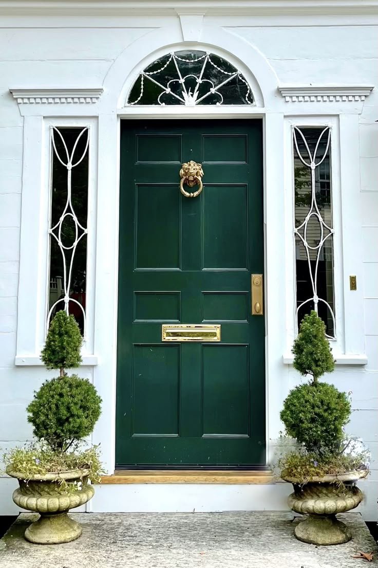
Green Front Door Ideas That Bring Character, Elegance, and Real Curb Appeal
Disclosure : This post may contain affiliate links or paid partnerships. I may earn compensation if you click a link or make a purchase, at no additional cost to you. See my disclosure for more info.
The moment you pull up to your house, you feel it.
Something’s not quite right about that front door.
The color is wrong. Not dramatically wrong — just quietly, persistently wrong. Like wearing the right outfit in the wrong color. Everything functions, nothing quite lands.
You’ve collected ideas. Studied homes you admire. And still the specific answer for your specific house remains just out of reach.
Here’s the part that matters: your front door does enormous work for almost no real estate. It defines the facade. It sets the emotional register for the entire exterior. It’s the invitation your home extends to everyone who approaches it.
Right now, that invitation is missing.
You know green is the direction. Something with genuine personality. Something that reads as chosen — not inherited from the previous owners or selected from the easiest option on the swatch strip. Something that makes the whole exterior feel resolved.
The obstacle is that green covers enormous ground. The wrong shade — too muted, too vivid, too warm, too cool — can undermine everything you’re working toward.
So here are the green front door colors that genuinely work, paired with the reasoning behind each one, so you can choose with clarity rather than guesswork.
Why Green Is the Most Versatile Front Door Color Available
Before the specific shades, it helps to understand why green performs so consistently as a front door color.
Start with biology. Green occupies the center of the visible spectrum, which means the human eye processes it with less effort than any other color. It’s restful to look at not because of cultural conditioning, but because of how our visual system is built.
Then add the practical reality of exterior compatibility.
Consider how many strong accent colors fail against certain exteriors. Red can fight with warm-toned brick. Blue can feel cold against cool gray stone. Yellow can tip from cheerful to overwhelming depending on the amount of white trim surrounding it.
Green sidesteps most of those conflicts. Against warm masonry, it settles beautifully. Against cool stone, it brightens. Against white or cream, it defines. Very few colors command that range of relationships.
And then there’s what green communicates. Renewal. Growth. Welcome. A green front door tells anyone approaching, before they even reach the step, that this is a home where care has been applied.
That’s worth understanding before you choose a shade. Now for the shades themselves.
1. Sage Green — Refined Restraint in a Single Coat
Sage green is the color for homeowners who know that restraint is its own form of confidence.
The gray undertones in sage prevent it from reading as purely botanical or countrified. It’s layered, complex, and capable of reading as genuinely sophisticated in ways that more saturated greens sometimes can’t.
Sage pairs beautifully with warm-white or cream trim, natural stone, aged wood details, and any masonry with warm or sandy undertones. It’s the front door color that makes a home look like someone with taste lives there — without making a production of it.
On brick or stone with golden, amber, or pink-inflected tones, sage is especially effective. It draws out the warmth of those materials without competing with them.
One thing to account for: Sage loses depth in strong, direct sunlight. If your door receives intense afternoon light, consider going a shade or two deeper than your initial swatch choice. Paint dries lighter than the chip — this is universally true.
2. Hunter Green — The Color That Has Never Gone Out of Style
Hunter green isn’t trendy. It’s better than trendy — it’s permanent.
This is the shade that appears on distinguished homes across centuries and across architectural traditions. Georgian. Victorian. Craftsman. Mid-century. Transitional. It adapts because it doesn’t try to match a moment. It simply occupies the category of “correct.”
Hunter green behaves as a dark warm neutral. It has authority without the coldness of black, and richness without the directional commitment of navy. It functions less as an accent color and more as a kind of deepened background that makes everything around it look considered.
The classic pairing: hunter green door + polished brass hardware. Add Brass door knocker, Brass kick plate, and Brass house numbers. This combination has an extraordinary track record on homes of all sizes and vintages.
One limitation: Cool-toned exteriors. The warm undertones in hunter green can conflict with blue-gray siding or very silver-toned stone. If your exterior runs cool, a better option is coming up.
3. Olive Green — Grounded, Unpretentious, and Genuinely Distinctive
Olive green asks you to value subtlety. And if you do, it rewards that preference generously.
It occupies the intersection of green and brown, giving it a thoroughly naturalistic quality. Olive doesn’t announce itself. It simply settles into its surroundings with a quiet confidence that draws appreciation from people who look closely.
For properties with strong landscape character — wooded sites, structured gardens, native plantings, stone paths that wind through a deliberate outdoor space — olive green is remarkably effective. The door feels as though it grew from the setting rather than being placed in front of it.
Against dark exterior schemes, olive also performs very well. It has enough color presence to read as an intentional choice against charcoal, deep brown, or dark gray — while remaining quiet enough to feel like part of a unified composition.
One caution: Shaded or recessed entries can push olive toward muddy or flat. Always test in the actual lighting environment your door inhabits. Fluorescent showroom lighting is not representative.
4. Emerald Green — When You Want the Door to Define the Whole Exterior
Emerald green is a decision, not a decoration.
It’s a full jewel tone — deeply saturated, immediately impactful, and unambiguously luxurious. It takes an entryway and turns it into a focal point. Not a subtle one. A genuine, stop-and-look-again focal point.
The architecture of the entry matters considerably here. Emerald demands crisp white trim as a counterpart — the high contrast between the two colors is what produces the effect. Without that contrast, even a beautiful emerald can feel heavy rather than dramatic.
Hardware shapes the personality. Matte black handles with matching hinges pushes emerald into a modern register. antique brass pulls it toward something richer and more historically rooted. Both choices are valid — pick based on what the rest of the home is saying.
Emerald’s optimal conditions: Paneled doors with genuine depth, flanking sidelights, carved or applied molding, transom windows. The more architectural detail available, the more emerald has to work with. On a flat, featureless door, consider upgrading to a paneled door first. The transformation when combining a paneled door with emerald paint is one of the most impactful and affordable exterior upgrades available.
5. Forest Green — The Color That Signals a Well-Kept Home
Forest green projects something that most colors simply don’t: a sense of permanence and care.
It’s darker than hunter green, more restrained than emerald, and carries a visual weight that communicates without announcing itself. A forest green door says: this home is looked after. The people here pay attention.
For traditional architecture — Colonial, Federal, classic American vernacular, farmhouse with actual history — forest green is an almost instinctively correct choice. Pair it with white or ivory trim, black shutters in a dark tone, and a paneled door form, and the result is curb appeal that remains attractive for decades.
From a practical standpoint, research on buyer perception consistently links deep rich greens with positive associations about home maintenance and quality. A forest green door often does more for the perceived value of an exterior than renovations that cost significantly more.
This is one of those cases where a relatively small investment produces a disproportionately large return in terms of how the home reads from the street.
6. Mint Green — A Lighter Choice With Serious Character
Mint green isn’t for everyone. It requires both confidence and context.
It’s light, airy, and carries an almost effervescent freshness that reads immediately as cheerful and welcoming. In the right setting, it’s one of the most charming front door choices possible. In the wrong one, it can feel mismatched.
Mint performs best on homes where character and lightness are already built into the architectural DNA: beach houses, tropical-inspired bungalows, mid-century modern properties with clean geometry, and neighborhoods where personal expression is valued over conformity.
The requirement for mint to read as sophisticated: absolute restraint in everything surrounding it. A very light or white exterior. Minimal trim detail. No competing accent colors anywhere on the facade. Let the door be the only statement being made.
When those conditions are met, a mint front door is genuinely memorable. It’s the kind of exterior choice that people describe to others later: “the house with the mint green door.” That level of recognition is rare, and it’s worth something.
7. Eucalyptus Green — The Modern Choice for Cool-Toned Homes
Eucalyptus green has earned its place in the design conversation over the past several years for a straightforward reason: it solves a problem that most other greens can’t.
For cool-toned homes — the blue-gray siding, pale stone, white brick, or light stucco that dominate contemporary residential construction — most greens create an undertone conflict. Too warm, and the green and the siding fight. Too neutral, and the door disappears.
Eucalyptus walks that line perfectly. It’s green enough to provide genuine color. Cool enough to harmonize with blue-adjacent exteriors. Soft enough to feel considered rather than assertive.
On the right house, eucalyptus with matte black hardware, concrete planters, and modern house numbers produces an exterior that reads as professionally designed. The modern-organic aesthetic — clean forms, natural materials, quiet colors — is precisely the register eucalyptus inhabits most naturally.
For the full effect: Flank the door with potted greenery — living plants, ideally — and the entry transitions from accent to environment. The door becomes part of the exterior rather than a feature sitting on top of it. That integration is what separates a well-executed front door from an exterior that reads as truly resolved.
The Checklist You Need Before You Buy the Paint
Your shade is identified. Before anything goes on the door, here are the five things that separate genuinely great results from ones that feel slightly off twelve months in.
1. Get physical samples and test them on the actual door. Every screen renders color differently. A peel-and-stick sample or a painted test board tells you something that no digital swatch can. Live with the sample for three to five days. Morning, midday, and dusk. All different.
2. Account for your fixed elements. The things you’re not changing — roof material, masonry, walkway, driveway — are the frame your green needs to fit within. Understand that frame before you commit to the color that lives inside it.
3. Choose your finish deliberately. High gloss intensifies color and reveals surface imperfections. Satin is forgiving and reads as polished without being reflective. For most front doors, satin is the most universally appropriate choice. Gloss should be selected intentionally, not by default.
4. Don’t skip the edges. Whenever the door swings open, the edge is visible. Painting it the same color as the face takes minimal additional time and is one of the clearest indicators of a professional rather than amateur finish. Do it every time.
5. Verify year-round performance before committing. A deep, rich green under a fall wreath in autumn looks extraordinary. But does it work alongside summer planters in the heart of summer? Front door colors that only thrive in one season eventually start to feel like a mistake in the others.
One Decision Between You and the Exterior You Actually Want
Everything you needed to make this decision with confidence is now in front of you.
You know the shades that perform. You understand which one suits your architecture, your exterior materials, and your aesthetic goals. You have a clear process for testing and confirming before you commit.
What remains is the decision itself.
One direction: More deliberation. More saved images. Another season of arriving home to a front door that doesn’t feel quite right.
The other direction: Order the sample. Get it on the door. Step back from the street and see what the exterior becomes when the door is finally right.
Painting a front door is one of those rare upgrades that costs very little and delivers a great deal. Not just aesthetically, but experientially. The feeling of arriving home to a house that looks exactly like it should is one that’s consistently underestimated until you actually have it.
Fresh. Considered. Worth the effort.
That’s what the right green does.
And you already know which one it is.